This is sound reflection on the Cd digipak design. you make some good comments, but I feel that you need to start providing more detail, to the points you make. In particular in relation to your contribution to the construction of the CD digipak cover and the need to address all the set evaluation questions. Please can you revise these posts this week.
Saturday 26 November 2011
Thursday 24 November 2011
Digipack Evaluation
For Digipack, we went to the studio to retake Sophia's picture for our front cover and back cover. During the process, we tried out various poses and expressions and finally we thought of that this pictures would be great for our front cover.
We used Adobe Photoshop to help for our digipack design.
We split our group work to make our progress quicker by Sophia and Vlad working on Digipack while Sophie Ritter and I working on editing our music video.
(Please check Sophia's blog for our process in digipack design :))
http://hurtwoodmediasophiakounopias.blogspot.com/2011/11/digipack-cover.html
This is our front cover


This is our front cover
We wanted to present her as sophisticate with dark edgy personality.
It creates a mystery for the audience,making them want to know about her as she is a three dimensional character ( Dark make up with white innocent night gown and a red underwear).
This represents her type of songs as ambiguous allowing the audience to percieve and listen differently. We are trying create an image that people would not forget
For our back cover, I deliberately made her red bra stripes placed out for the shoot because I wanted to give 'Dummy' a star image of inner sexiness, something mystery and giving the audience a sense that this singer has different layers of skills/characters to it which makes it very adventurous and exciting.
Similarly with the front cover, we used lots of low saturation and low key lightingto enhance the dark nature to the song.
I purposefully chose a different hairstyle for Dummy on the back cover to make the audience realise that there is something not quite right about the picture.
I tied her hair in this particular hairstyle because I wanted to made her look class, Victorian style reinforcing that her imager is classy and sophisticated and that this is a singer for an age range of 17-34 audience.
This is our rough Digipack cover

We had to to redo the inside cover because it was more for EP single release rather than the whole album as we were using shots from our music video shoot day. Nevertheless, our concept was solid as we want to have an idea of police report for our digipack design.
Saturday 19 November 2011
Feedback
This is a good diary account of production. i feel you need to add a technical dimension to your blog in terms of set design, technology used and what brand image you were trying to create for the band. I t is important to link the process to it's intended outcomes. So consider in this instance what went well and what could have gone better for you.
Wednesday 16 November 2011
Evaluation of the shoot day
8:45 - 9:50am


In order to make her feel comfortable in front of the camera, Sophie and I asked her to dance and do whatever the music made her feel. The first take was good and she was beginning to warmed up. So I told her to use her hands and legs more and be more snakelike. On the second take, she was beginning to feel more confident and she took in my advice very well as she was beginning to have disturbed, manipulative character as she was beginning to have the images in her head. With Sophie and my help in hands choreography, she was beginning to understand the character and it became natural for her. She became 'Dummy'. That was what we were aiming for.
As soon as we arrived at the studio, we dashed off to get everything ready for the shoot.
I helped Sophia to start putting on her costume while Sophie Ritter helped her with make up right from the start because we knew that it will take awhile. To save time, I went to help set up the bedroom set when Sophie Ritter was busy doing make up for Sophia. Meanwhile, Vlad was setting up the camera and adjusting the lighting for the room.
THis is how the set looks like:
It was great set and we were all thrilled by the achievement as it was better than what we have expected. We were ready for the next step- Filming !!!
I took the role of a director during the shoot. Since Sophia was the singer 'Dummy' in the music video, I feel that it was my responsibility to ensure that Sophia finds herself the character 'Dummy' and how she was going to portray, what does she want the audience/her fans to feel or think? I kept referring back to Star Image (innoncent, yet dark and quirky). So I constantly reminded Sophia that she is innocent, pure but dark at the same time. The reason why she is dark is because she had a painful past where she killed her lover and that she feels guilty. She is mentally disturbed.


In order to make her feel comfortable in front of the camera, Sophie and I asked her to dance and do whatever the music made her feel. The first take was good and she was beginning to warmed up. So I told her to use her hands and legs more and be more snakelike. On the second take, she was beginning to feel more confident and she took in my advice very well as she was beginning to have disturbed, manipulative character as she was beginning to have the images in her head. With Sophie and my help in hands choreography, she was beginning to understand the character and it became natural for her. She became 'Dummy'. That was what we were aiming for.
Half of our day had gone so quickly, but we have finished the shooting shots of her present day on the bed, close up shots of her, pull focus shots and tracking shots. Our next aim was to shoot her past with her lover(Walter) after lunch at the Radnor’s bathroom.
However, we changed our plan, as we were happy with the marvelous set we had so we decided to shoot on the same set inside. Walter was very professional as he did what he was told and it was easy to work with him.
Since this was the only day we would be shooting, so we really wanted have our best shots for editing, so we took many different shots such, tracking, bird eye view, etc for the same shots, so we stayed longer at the studio.
We decided not to have shots of cards in the water tank because we realized that what we have so far were so good that we might ruin them if we put in shots of cards which were no longer relevant to our video. . This time, my role was working with the camera and how to use it and I also did playback, During this process, I realized that it is important to use media terminology such, standby, action, playback,etc.
We finally finished at 4.45pm with the shot of broken wine glass (slow motion), it was our best shot ever and we are so proud of it. I was our best shot because we used a special effect and we used to shoot it with two cameras.
We were happy with our work as we worked efficiently.
Evaluation of the day before the shoot day
The day before our shoot day (Monday,2pm), we went to the studio to set up by puttiing wooden floorboards, putting up wallpaper, creating the window and the curtain to make it appear like a bedroom. There were come changes with our concepts such as we were meant to be shooting a cross burning. Then we thought about the impracticality of burning the cross as we would not be able to do that. However, we came up with a better idea which not only gave the room a better lighting and but also made our theme ideas more significant in our music video.
Another significant change was when we decided not to have a set for bathroom scene as we have decided to use the real bathroom at Radnor, boarding house instead to give a real sense of a bathroom from the screen. I thought we have managed our time real well and worked efficiently because we each have divided our task individually such as Vlad and Sophia went to do screen test with Walter in one of the classroom whereas Sophie and I worked on setting up the set by applying glue on the wallpaper. I was also popping in and out to help giving directions and rehearsal techniques for Sophia and Walter on what they should be focusing in front of the camera so that we would not have to waste time on the shooting day sorting out what we want the actors to do. I also thought that by having a screen test for the actors before the shoots would helped them to feel comfortable with each other especially they have to kiss and required an intimate relationship on screen and be prepared for the shoot.
Another significant change was when we decided not to have a set for bathroom scene as we have decided to use the real bathroom at Radnor, boarding house instead to give a real sense of a bathroom from the screen. I thought we have managed our time real well and worked efficiently because we each have divided our task individually such as Vlad and Sophia went to do screen test with Walter in one of the classroom whereas Sophie and I worked on setting up the set by applying glue on the wallpaper. I was also popping in and out to help giving directions and rehearsal techniques for Sophia and Walter on what they should be focusing in front of the camera so that we would not have to waste time on the shooting day sorting out what we want the actors to do. I also thought that by having a screen test for the actors before the shoots would helped them to feel comfortable with each other especially they have to kiss and required an intimate relationship on screen and be prepared for the shoot.
Sunday 30 October 2011
Shooting date has changed!
We are now going to shoot our music video on the 8th Nov 2011, Tuesday instead of 17th Nov 2011, Thursday.
Friday 14 October 2011
Feedback
This is proficient bloging, the animatic is clear and like your shooting schedule which may need to be revised leading up to your film shoot. Do post photo's of your cast members and try to organise the images of props used - see me regarding this next week. With the set design and lighting recommendations, try to link these with real practice and the media concept of mise en scene. Also try to evaluate the use of lighting and whether thsi is directional, key or fill; high/low contrast?
Casting process and finalist!
After discussing with our teacher about our casting list, we found out that Jess, Merlin and Teymour are involved in more than 3 music videos and that they can't be doing more as they will be missing their classes. So we have to come up with a plan B. Luckily, we found a pair who happens to be available for the music video.
This is our finalists : Emma Frances Hodgson and Frankie Dixon.
Emma as Dummy, the lead singer

 We thought that she is edgy yet glamourours and she has the look of innocence and vulnerability which would be great for the music video as she is suppose to be playing a victim who was abused by her boyfriend. She is a drama student so that means it will be very easy to work with her in terms of directing on the shooting day.
Also for the album cover, I thought she would be able to pull these looks ( these dummy posters were made by Sophia)


Freddie as Dummy's abusive boyfriend.
 He would be a perfect role to play an abusive boyfriend as he has that rough edge and he looks fierce.
 Emma and Freddie are good friends which means that they will be comfortable with each other on the set during the shoot. This is important as we as directors and them as actors would be able to save time and move on quickly with the shots we need to take. I feel that when actors are comfortable with each other, it is less awkward, more fun and enjoyable to film.
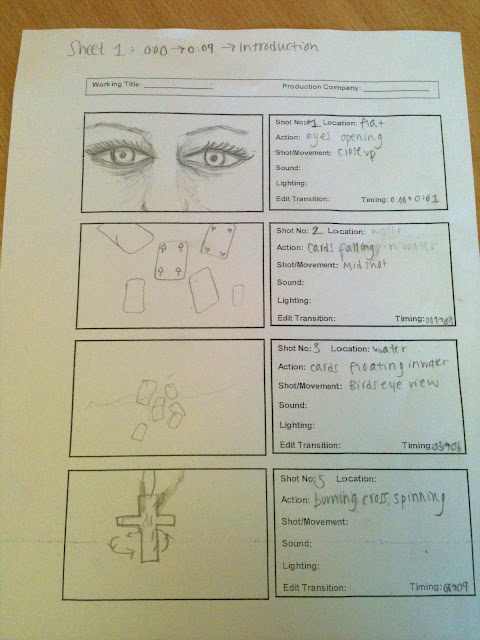
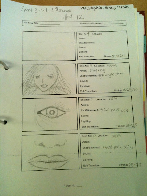
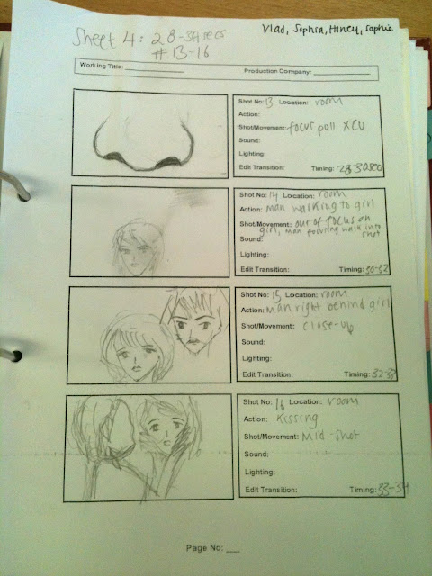
Evaluation on animatic storyboard
Thanks to the animatic storyboarding, we managed to visualise about how our video is going to be potentially. It also allow us to be realistic about which shots we could do and which shots we could not do. For example, we could not have the burning cross in because of the danger so we are going to have cross chain instead.
In the beginning of the song, we have the lead's pair of eyes and this shot is very significant because we are trying to connotate the narration from her point of view.
Thursday 13 October 2011
Shooting Schedule (provisional)
Time | Plan |
8:40- 9:00 | Group meeting in front of media class Final checklist of props, costume,etc. Ready to go! |
9:00- 10:30 | Filming the 'flashbacks' in the bedroom. Setting up bright lighting for dawn. |
10:30- 10:45 | Break |
10:45- 11:15 | Shooting in the same set but ripped and worn down to juxtapost from the past. Filled in darker shades of lighting. |
11:15- 13:00 | Filming the single shots and hand shots |
13:00- 13: 50 | LUNCH BREAK |
13:50- 15:00 | Change to bathroom set to shoot bathroom scenes Different lighting Touch up on make-up , rolling actors in for action ,etc. |
15:00- 16:30 | Filming cards Filming Hand shots (on a plain white background) And other shots that need retaking. |
16:30- 17:00 | Removing the sets GO HOME! |
Feedback from the lighting and set designer
We pitched our idea and the concept we are going for to Den, the lighting and set designer, today. And he gave us some tips about the set design and we decided that our set was going to be representational rather than literal.
Our bedroom is going to be consisting of two walls, a very plain window, a bed and a wooden chair. The main source of light will be from the window, we will use a yellow hue to ceate the effect of a street lamp.
Our bathroom is going to stay the same but we are including window sill with the plastic blinds in order for the light to come in. This is to reinforce that even though she tries to hide, she can't escape from it.
For the lighting, we are going to have dark blue, green and violet/purple lighting to symbolise her agony, pain, loneliness and cold.
We like the idea of lighting and we would like to achieve something like that for our video too
Set design and lighting
Lighting design
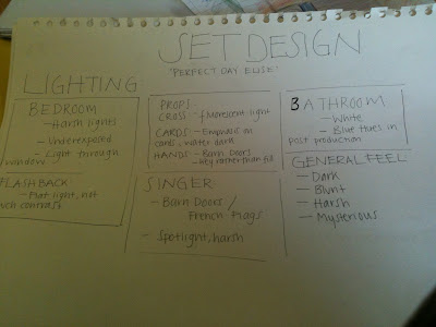
As a group, we were very keen on the concept of using dark, cold lighting to help match the theme of the song(which is about domestic abuse/violence).
This is a rough sketch of what the set might look like:
We are interested in using dark, blue lighting to represent coldness. This is because we wanted the audience to be on the lead singer's side and it is from her point of view.

As a group, we were very keen on the concept of using dark, cold lighting to help match the theme of the song(which is about domestic abuse/violence).
This is a rough sketch of what the set might look like:
 |
 | ||||
| I added some green colour into the dark blue for the bathroom to represent old mouldy bathroom. Set Design We then finalised that we want to have two sets for the video:
Bathroom layout
|


Tuesday 11 October 2011
Costumes and Props Lists
Props:
 Cigarette
 Cards
Cards
We wanted to have the lead singer in a pure innocent look in the past memories shots.
.jpg) White Night dress (something soft and flowy to represent her
White Night dress (something soft and flowy to represent her
vulnerability)
 Fish tank for the cards' shot. We are using a clear fish tank is because we want to have a shot of cards falling and swirling in the water, in order to do that we need a clear tank.


CigaretteCardsWe wanted to have the lead singer in a pure innocent look in the past memories shots.
White Night dress (something soft and flowy to represent hervulnerability)
Fish tank for the cards' shot. We are using a clear fish tank is because we want to have a shot of cards falling and swirling in the water, in order to do that we need a clear tank.Costume
We want to create an innocent yet sexy image for the lead as this will help brings out her edginess. So we thought by using silky white dress with red lipstick. We also like the idea of juxtaposing the two contrasting images and combined them. For example, being innocent but sexy and vengeful at the same time.
For the guy, he is going to be wearing a plain shirt with dark blue jeans, we are going for a rough casual look.
Friday 30 September 2011
Feedback
Can you please post who the target audience is and the reearch into CD covers and digi packs - do a presentation or mood board if it is easier.
Your response is sound and you have been creative with your blogs, I particularly like the use of headings with good layout and design. Load the images securely I cannot see them.
You have a secure knowledge and understanding of who you want your artist to be signed to; perhaps you could link this further by stressing the advantages that your artist has signed to the particular record label.
Digipack Cover
Since our song is quite queer and we would like to have a grungy, indie, black and white style.
 instead of Black and White title, we were thinking naming it Dummy as this would be the name of the artist.
 I like the idea of having a blur image yet defined image as this will portrat a mystery to it.
Our main target audience is any gender and age of 17-35 and who likes listening to alternative, indie music.
instead of Black and White title, we were thinking naming it Dummy as this would be the name of the artist. I like the idea of having a blur image yet defined image as this will portrat a mystery to it.Thursday 29 September 2011
Research and evaluate the institutional context of PJ Harvey
Biography of PJ Harvey
In 1993, PJ Harvey was signed to Island Records. Island Records was founded by Chris Blackwell and Graeme Goodall in Jamaica and was later relocated to UK in 1962. Island Records is considered to be a bigger independent company. Just like the big 5 major companies (Universal/Sony), they too have big artists signed under different genres such as Rock, Punk, Alternative, RnB,Pop,etc to help promote their company, gain more publicity and moreover, income.
We have artists like Akon, Mika, FLorence and the machine, Macy Gray, Nicki Minaj,and many more.
So the Island Records used the advantage of the internet to create spider-web like to help cross-promote the artists. For instance, while I was looking at the Island Records for my personal research, they have a small box where they automatically play music videos from different genres and this is interesting as i was drawn into some of the songs.
Likewise, the Island company used synergy to cross -promote singer/songwriter PJ HArvey by having her songs on movie soundtracks.
This is the website where it will tell you about how she is involved through different sources of media.
http://www.imdb.com/name/nm0367667/
Official website : http://www.pjharvey.net/
- Polly Jean Harvey
- Born in England on October 9th 1969.
- Was raised on a sheep farm in Yeovil, Somerset.
In 1993, PJ Harvey was signed to Island Records. Island Records was founded by Chris Blackwell and Graeme Goodall in Jamaica and was later relocated to UK in 1962. Island Records is considered to be a bigger independent company. Just like the big 5 major companies (Universal/Sony), they too have big artists signed under different genres such as Rock, Punk, Alternative, RnB,Pop,etc to help promote their company, gain more publicity and moreover, income.
We have artists like Akon, Mika, FLorence and the machine, Macy Gray, Nicki Minaj,and many more.
So the Island Records used the advantage of the internet to create spider-web like to help cross-promote the artists. For instance, while I was looking at the Island Records for my personal research, they have a small box where they automatically play music videos from different genres and this is interesting as i was drawn into some of the songs.
Likewise, the Island company used synergy to cross -promote singer/songwriter PJ HArvey by having her songs on movie soundtracks.
This is the website where it will tell you about how she is involved through different sources of media.
http://www.imdb.com/name/nm0367667/
Official website : http://www.pjharvey.net/
Sunday 25 September 2011
Storyboarding
Storyboarding was very interesting. I am really enjoying it and that's because we were working together as a group. We all chipped in ideas and shot choices, so that made us easy to work with each other and feel positive about the video.
We listened to music while storyboarding as we need to ensure that the music video will tie in with the motion picture.
This is what we have so far...
We listened to music while storyboarding as we need to ensure that the music video will tie in with the motion picture.

This is what we have so far...


The pitch
Before going further with our ideas for the music video, we had to present a powerpoint presentation for Luke who would helping us with equipments and supervise us on the day of our shooting day. As a group, we have divided the tasks among ourselves to do them for prep and then combined together as one presentation for Luke to see. He seemed to be happy with most our ideas and structure however, he wanted us to work on scene choices further because our shots are quite limited at the moment.
Pitch
Pitch
Progress in developing ideas
Changes in the choice of track:
We changed the song to 'A Perfect Day, Elise' by the same artist, PJ Harvey. We chose this song instead because we felt that this song has a better transitions of song (different beats) than the previous song choice. Also it will be pretty difficult to find a suitable young girl to be in the video.
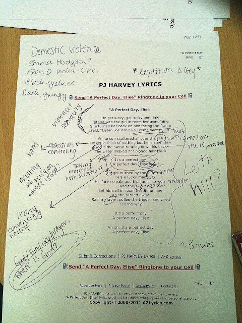
We then analysed the the lyrics in order to help us with storyboarding. We came up with loads of ideas and themes. We then watched the original music video together as we wanted to know how they interpreted it and we also did not want to overlap ideas.
This is the original music video:
Shot styles and ideas we have in mind:
We love the idea of fish eye ball shots. It looked as if someone watching from a public point of view about domestic violence and take no action to it or it could be that it was from the main character's eye where she revealing her past. We wanted the ambiguity in our music video. We want audience to draw into our abstract music video and make up their own narration in their own way. We want them think. The reason behind it is because we are trying to sell the her song through the music video. We want the audience to draw into the music video and be on her side.
We also like the idea of focus pull to reinforce the ambiguity to the audience.
This is the video which Vlad showed us.
So the main themes we decided to include in the music video are domestic violence, water (cleansing the past/washing away), hands ( representing violence/torture) and cross (signifying religion).
We changed the song to 'A Perfect Day, Elise' by the same artist, PJ Harvey. We chose this song instead because we felt that this song has a better transitions of song (different beats) than the previous song choice. Also it will be pretty difficult to find a suitable young girl to be in the video.

- There's a load of double meanings in this...'Hitting on the girl' (as in way hay wink wink get in there boy) as opposed to 'HITTING on the girl' (should be slightly obvious - the guy hitting her).
- So there's a load of violent themes in here and sexuality issues.
- And I reckon she's got a thing against God...she seems to be attacking religion in reference to 'God is the sweat running down HIS back' - the guy is powerful because God is helping him but not her. -According to Sophia Kounopias.
We then analysed the the lyrics in order to help us with storyboarding. We came up with loads of ideas and themes. We then watched the original music video together as we wanted to know how they interpreted it and we also did not want to overlap ideas.
This is the original music video:
Shot styles and ideas we have in mind:
We love the idea of fish eye ball shots. It looked as if someone watching from a public point of view about domestic violence and take no action to it or it could be that it was from the main character's eye where she revealing her past. We wanted the ambiguity in our music video. We want audience to draw into our abstract music video and make up their own narration in their own way. We want them think. The reason behind it is because we are trying to sell the her song through the music video. We want the audience to draw into the music video and be on her side.
We also like the idea of focus pull to reinforce the ambiguity to the audience.
This is the video which Vlad showed us.
So the main themes we decided to include in the music video are domestic violence, water (cleansing the past/washing away), hands ( representing violence/torture) and cross (signifying religion).
Friday 16 September 2011
Research into real artists of a similar type
Sophia Ritter, Vladimir, Sophia Kounopias and me have finally came up with indie for our genre and we wanted a grungy feel to it. Like smokey effect, black and white texture with arty shots of hands.
Sophia Kounopias suggested that we should go for a dark grungy look and the song we should look go for is My Beautiful Leah by PJ Harvey.
I thought it was somesthing different from the pop music video and we as a group were happy to work with the song for the music video.
The song is about a girl who was lost. And Sophie Ritter generate this idea of mother and daughter relationship and then we refer to Shining the horror film. Together we came up with :

We will definitely look further in details regarding the practicality of finding little girl or choosing a suitable location to shoot it. This is our basic idea which we have in mind and it might probably.

Another idea which I came up with was shots of hand choreography and I got this idea from the Dev- In the Dark. Since our music video is moving towards darker shade of lighting and grungy look, I thought we could use black background with red/black coloured hands to reinforce the metaphors of the music video. We have decided that we wil go for less narrative in the music video, rather more abstract more abrupt as this will make the audience to think more. So it is very ambiguious and different people with different ways interpreting it.
The artist we looked at was Pj Harvey. her style is very organic as her video is about her music and not her image, therefore she is not very advertised and that very few people know. She reminds me of Kater Bush.
PJ Harvey has a rock and roll / grungy/vintage style.


Feedback
A proficient blog which covers many initial concepts. I feel there is some very understanding of the role of the music video and even better if you can support points with wider readings and a little more detail to your posts. Well Done - good use of mood boards to support your creativity with the blog.
Synthetic and organic
We looked at what kind of image we would like to use for our music video. We looked into several videos consisting both synthetic and organic.
What is synthetic?
Synthetic is a a structred form of image to promote their songs/artist. It usually does not lasts very long and their target audience mainly for the 11-17 years old audience.
Let's take a look at this;
These three videos are a similar form of videos where their star images are a boy band group who are young and cute. Most young ladies would go crazy for them because of their good looks while young boys would follow their style of clothings.
Organic?
Their style of music videos and musics are quirky and their target audience are niche audience. For example, Radioheads and PJ Harvey whom I have not heard of them till this week.
Their videos are really interesting and I am really inspired to create a similar version of it.
I like the idea of having just one person in the music video as it is less messy in terms of directing the actor what to do. I also thought that it will have a potential for us to experiment with differnt shots and effect with it.
Richard Dyer's Theory
A star is an image - constructed through advertising, magazines, and films.


She is represented as a sexy gorgeous singer. This is extraordinary as we as a media wish to be like her.


Here she is represented as she gets married and pregnant and this is present. However she is absent as she is a celebrity with beauty and money.
For example,

She is represented as a sexy gorgeous singer. This is extraordinary as we as a media wish to be like her.
Here she is represented as she gets married and pregnant and this is present. However she is absent as she is a celebrity with beauty and money.
Subscribe to:
Posts (Atom)